There is a website called, www.findyourtribe.com which puts you into a category based on your likes, dislikes and interests. Below is my results after taking the quiz;
Thursday, 3 March 2011


Michel Gondry - Music Video Director
"Sometime it's better to have less money (for budget) and more freedom"
- Michel Gondry
Michel Gondry was born May 8th, 1963 and is a French music video director who is also known for his commercials and academy award winning screenwriting. He has directed music videos for artists such as Daft Punk, Foo Fighters, White Stripes, The Chemical Brothers and Radiohead. His videos usually use time and repetition to give a surreal edge to what could possibly be a boring music video. He uses colour and costumes to make his videos more surreal. Gondry shows that a music video doesn't need to have a narrative or anything else that coincides with the lyrics in order for it to be effective.
Daft Punk - Around The World
- Quirky and colour.
- Characters in crazy costumes (e.g. swimming costumes, mummies etc.)
- It's a simplistic looking video however it's very busy and has a lot going on.
- Camera is placed in different angles to make it visually interesting.
- The video follows the repetitiveness and simplicity of the lyrics of the song.
The White Stripes - Hardest Buttons to Button
- Repeats the instruments as the artists move around.
- The editing is fast and snappy to match the pace of the song.
- Uses interesting camera angles.
- Shows the artist performing the song.
- Uses a similar colour scheme (primary colours) throughout the video.
Star Analysis - The Kooks

The Kooks are an indie/pop band who formed in Brighton, East Sussex in 2006. They have reached the top of the charts with a number of their singles from their album inside in/inside out, which was their debut album.
The music video for the song 'Naive' mainly consists of the lead singer walking around a dark bar/club looking for someone. There are occasional cuts from the bar/club to the lead singer and a girl sitting at home. The lighting is dark to show the dark place he's in, however, you are still able to see that he is lip syncing along with the lyrics of the song. The video is outlandish or in your face, instead it is incredibly simple, and you don't see a lot, however it is a good video to sell the lead singer. One thing I don't like about the music video is that it only sells the lead singer and not the band as a whole, as you very rarely see them.
The music video for the song "She Moves In Her Own Way" shows the band as a whole and is therfore different to "Naive". This video helps to sell the band to their target audience as everyone is shown. The video shows lots of different clips of the band in different places around the world, which is something that isn't seen very often in music videos, representing the bands individuality.
What the Song Means to Me
While listening to the lyrics of the song, I visualised what I wanted to do for the music video that we are to create. For example, I think that both a performance and a narrative section of the music video would work well with both the song and the bands image as well the alternative/indie genre that the band are in.
I think that a contrast between the performance and the narrative is a good idea. For example, the use of a gig would be able to show off how the band perform to an audience and how they react towards each other while on stage. Also, this could be a busy gig to show how popular the band is, while on the other hand, the narrative part of the music video in a pub could be quite quiet, with just the band hanging out together to show how close they are as a band as they share their spare time together, and also how people only like them for their music.
Some fans only like an artist for their music, not for how they are as actually human beings, and this video therefore reflects that.
I think that a contrast between the performance and the narrative is a good idea. For example, the use of a gig would be able to show off how the band perform to an audience and how they react towards each other while on stage. Also, this could be a busy gig to show how popular the band is, while on the other hand, the narrative part of the music video in a pub could be quite quiet, with just the band hanging out together to show how close they are as a band as they share their spare time together, and also how people only like them for their music.
Some fans only like an artist for their music, not for how they are as actually human beings, and this video therefore reflects that.
Meaning Behind the Lyrics
From reading the lyrics to the song 'Tired Eyes' by City Lightz, I've come to the conclusion that the song is about a group of guys that are out in a club having a good time, and one of the guys sees the girl behind the bar and his night then revolves around trying to impress the girl, while at the same time still having a fun night out with his friends. We also thought that to add to the alternative/indie element of the band that the end of the band, the lead guy could wake up in the bar/club that the rest of video was in, however he's on his own with a table full of empty glasses.
The images I got from listening to the lyrics where things such as a performance within a crowded club or a crowded gig, with people drinking, dancing and generally having fun. I also thought of a pub/bar linked to the alternative/indie scene with a group of guys fighting, playing pool and getting drunk in a bar.
The images I got from listening to the lyrics where things such as a performance within a crowded club or a crowded gig, with people drinking, dancing and generally having fun. I also thought of a pub/bar linked to the alternative/indie scene with a group of guys fighting, playing pool and getting drunk in a bar.
Our Album Cover

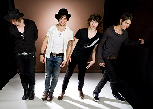
For the front of the album cover I'd quite like to use the above picture. We could cut out the background, just leaving the band so that potential buyers won't be distracted by anything in the background, instead they will be able to focus more on the band. I think it would be good to change the colouring to black and white to make the band seem more like a unit.

For the back of the album cover I think it would be good to use this. I think to make it look more professional I'd like to cut out the band and the pool table so that there is no background of the pub and to make it black and white. Possibly to make it more visually interesting we could keep the green of the pool table while the band are in black and white.
We could then use a contrasting colour on the green pool table to show the song titles or any other details to put on the back of the album cover.
Subscribe to:
Posts (Atom)