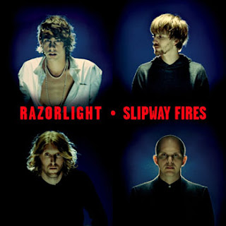
- The four corners of the cover are used for each of the four band members, which I like as it means the facial expressions that they use is their own and could be to show how they feel the album should be presented. It also shows that each band member is an individual, which is an aspect of this album cover I like.
- In the top left-hand corner, the guy is wearing lighter clothing and stand out more compared to the other three band members who are wearing black, this could be to present to anyone who is unaware of the band that he is the front man, and they usually stand out more compared to the rest of the band.
- Each of the three guys are standing in a spotlight - this could be a metaphor for their lives, now that they are a part of a well-known band they are constantly in the spotlight with the media.
- The band names and the album name are written in the centre of the album cover in a bright red colour, this makes them stand out against the dark background.
This album cover is similar to that of The Plain White T's as it contains all four band members and is quite simplistic. I like the colouring of the red on black for the text as it makes it stand out a lot, drawing peoples attention to it.

No comments:
Post a Comment