Wednesday, 11 May 2011

Evaluation: In what ways does your media product use, develop or challenge forms and conventions of real media products? (Part One)

Below are nine key frames that I have taken from other music videos. I have decided to use music videos from the indie genre to show how they are similar and different to my own music video.

1.   This shot is taken from the music video for "Foundations" by Kate Nash. The reason that I chose this shot is because at this point the lead character has walked over to the fridge to reveal a lot of beer in the fridge door, this happens when she says "why don't you just have another beer then". Throughout this music video the visuals match the lyrics.

2.   This shot is also taken from the music video for "Foundations" by Kate Nash. The reason that I chose this shot is because it establishes who the lead character is within the narrative. Close-ups of the lead characters face is one of the main conventions of the indie genre. Also this part of the music video shows the lead character lip-syncing with the lyrics.

3.  This shot is taken from the music video for "Chelsea Dagger" by The Fratellies. The reason that I chose this shot is because it goes against the conventions of the indie genre. Usually the frontman (singer) of the band is the first person to be shown in the music video, and the majority of the time they are the main person to be used within the video, however in this music video, the drummer is the first person within the band to be shown in the music video.

4.   This shot is also taken from the music video for "Chelsea Dagger" by The Fratellies. The reason that I chose this shot is because it shows the band performing together on a stage. Having performance and narrative within a music video can be seen in quite a few indie music videos as it establishes the band and shows how they interact with each other when performing together.

5.   This shot is taken from the music video for "Naive" by The Kooks. The reason that I chose this shot is because this music video reminds me of my own music video. This shot shows the lead guy in a club/bar walking around looking for someone. The shot establishes him as the main artist of the band as while he is walking around he is also lip-syncing with the lyrics. The use of darkness in this video is uses to represent how the lead guy is kept in the dark by his girlfriend.

6.   This shot is also taken from the music video for "Naive" by The Kooks. The reason that I chose this shot is because it shows a contrast between how the couple used to be and how they are now. Another reason that I chose this shot is because it reminds me of my own music video as the narrative is in quite bright light while the performance is very dark lighting.

7.   This shot is taken from the music video for "Talk You Down" by The Script. The reason that I chose this shot is because it introduces and establishes the frontman of the band and the lead male of the narrative. Close-ups of the frontmans faces is one of the main conventions of the indie genre, this also shows him lip-syncing with the lyrics of the song.

8.   This shot is also taken from the music video for "Talk You Down" by The Script. The reason that I chose this shot is because it shows the narrative part of the music video which matches the lyrics of the song, "grabbed your suitcase called a taxi". This music video is very similar to my own as it contains both narrative and performance within the music video.

9.   This shot is also taken from the music video for "Talk You Down by The Script. the reason that I chose this shot is because it establishes The Script as a band, performing together on a roof-top. Showing the band performing is one of the conventions of music videos within the indie genre.

Evaluation: In what ways does your media product use, develop or challenge forms and conventions of real media products? (Part 2)

Below are nine key frames that I have taken from our music video.


1.   This is the first shot of our music video and it is from the performance part of our music video. It is a simple shot that shows the lead guys foot tapping to the beat of the song, it is quite a long shot that pans to one of the guitarist. It is mainly music that is with this beginning part of the music video, when the singer says "shit" the lead guys foot lifts up from the floor and properly taps the floor. To follow one of the conventions of the indie/rock genre we have used this part of the music video again later on in the song.

2.   This shot shows the lead guy singing. This shot in the music video shows our lipsyncing. It is quite a simple shot and the camera changes from being on his left side to being on his right side.

3.   This shot is of myself acting as the barmaid in a pub. This shot follows the lyrics of the song that say about the girl behind the bar. In our music video we decided to be different in how we portrayed the narrative, we thought that just because the visuals are matching the lyrics, it doesn't mean that they have to be put together. So in order to be different with our music video we decided to place this shot just after the lyrics because then it seems more like the guy is dreaming about her.

4.   As with shot number 3 this shot follows the lyrics, however unlike shot number 3, these visuals and lyrics are shown at the same time as we thought it would be a bit strange for the visuals to be constantly following the lyrics and the audience may get bored of this. This shot also shows the different cinematography that we have used within our music video. The majority of the cinematography is medium-shots, however here we wanted to capture what the lead guy was singing about, therefore we decided we would use an extreme close-up.

5.   This shot shows the first proper time that we introduce Jack to the audience as the lead singer of a band. The only time we really properly show Jack singing with the band as one of the performance parts of the music video is during the chorus, this is mainly because for the verses we had a lot of lyrics that we where able to work with that had a lot of narrative within them, however the chorus was a lot harder to work with, so by using a performance was a lot easier for us and it also follows the conventions of the indie genre.

6.   Another convention of the indie genre that we have followed is shown in this shot, which is to have close-ups of the other band members. This is a close up of one of guitarists, Tom. It is only a quick shot of him as most indie music videos spend more time of the lead singer rather than the guitarists.

7.   This shot shows one of the transitions that we used within our music video. Most indie music video use a simple cut to switch from different shots, scenes of locations, however, we wanted to break some of the conventions of the genre, and also we thought that by using transtitions is would make our music video more visually interesting and different, and something that audiences would remember and want to watch again.

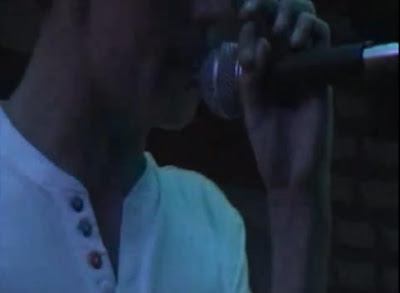
8.   This shot is very dark and difficult to see, but it is of the audience from the gig that the band did at The Charles Ground Football Club. We thought that it would be a good idea to put in some shots of the audience that we at the boys gig as we were able to realistically show how the audience reacted to the band and their music. Also, groups of people dancing to music can be seen in many indie music videos.

9.   I really like this shot as it wasn't staged, and it looks a lot like friends filming friends which was the feel we wanted for our music video. We didn't want it too looked staged as we wanted it to be a very natural video. Also, if the boys had been staged in everything that they'd been doing then they would have felt awkward, which wouldn't have looked good on camera, and also it would make anyone watching the video feel awkward which wasn't something that we wanted with our music video.

Evaluation: How effective is the combination of you main product and ancillary texts?

Music Video

We used an unsigned band and one of their own songs for our music video, the reason for this was because it was a lot easier to contact them and they were okay with us using one of their songs. We thought that this way would be a lot more easier than trying to contact as signed artist as they may not want us to use one of their songs.
The story behind our music video is quite simple to grasp as the narrative part of the music video links with the lyrics of the song. The video is about a guy who's out enjoy himself with the lads when he sees the girl behind the bar and he tries to impress her. We know the boys quite well and we wanted the music video to reflect their personalities, therefore we tried to have some comical elements within it which I think worked really well in the video.


Digipack

The ancillary products we decided to do where the digipack and the poster. For the inside of the digipack I decided to use some shots of each individual band memeber from the music video. The reason for doing this was so that potential buyers would be able to see these images and relate them to the music video. However, I thought that if I inverted the colours to make them negative it would make the inside of the digipack more visually interesting, and it is also not something that I have seen before and I wanted these ancillary tasks to be different and individual instead of copying what is already out there on the market now. For the front and back covers I've used two staged photographs that I took of the band. I think that the colour works well and isn't too bold, bright or dark.


Poster

My first draft for the poster was quite boring as it was only a white background with colour photographs of the band. I tried to edit the colouring of the pictures but it began to look very similar to a poster that I had seen for The Arctic Monkeys so instead I inverted the colours to make them negative, like what I did with the inside of the album cover. I like my poster and I think that the colouring all works well together, but I still think that there is something missing and its still a little bit bland and boring with a plain black background.


Evaluation: What have you learnt from your audience feedback?

Music Video
On our first cut of the music video we showed Mrs Stone, who gave us some quite good feedback on how she expected the video to look, she also gave us some ideas of possible changes we could make. She thought that the first shot that we use is too long and doesn't really introduce anyone in particular within the band, she expected to see Jack the lead singer, however we decided that we wanted to try and break a few conventions of the genre. In the end we kept this shot and when showing it too our target audience they all agreed with us on keeping the shot and they liked that it was different and not the same as all the other music videos of the genre.

The main criticism that we recieved from our audience feedback was that the scenes we used from the gig at The Charles Ground Football Club for the performance part of the music video are too dark. I agree with this. When we were editing the music video in Adobe Premier these shots didn't looked quite bright (not as bright as the narrative scenes though), however, as soon as the video was put onto youtube the scenes looked a lot darker and very pixellated.
This would be the main thing that I would change in our music video. Instead of using a proper performance from the band instead I would have rented out The Charles Ground Football Club and staged the boys with proper lighting so that they are more visable throughout the performance. This also would mean that there wouldn't be a massive lighting change between the performance and narrative parts of our music video.


Digipack and Poster
Overall the feedback recieved for both the digipack and the poster has been quite positive, this is mainly because I inverted the colours of some of the pictures to give them an alternative feel and too also make then stand out and be eyecatching to any potential buyers.

Evaluation: How did you use new media technologies in the construction, reasearch, planning and evaluation stages? (Part One)

Throughout this whole course, Blogger has been the main media technology that I have used. It is simple to use and has been a good website to log all of the work that I have done over the year, from research to analysing other products to uploading my own products and pictures. 


It was difficult to find a time to book out a camera and tripod for the same weekend that we were meeting up with the boys to film the music video. Therefore we decided to use Manals own camcorder and tripod to film the scenes.
We used the tripod for the performance scenes that we filmed at The Charles Ground Football Club, this was because the boys where performing live and we didn't want the camera work to be shaky. We also thought that there was more risk of us being pushed and breaking the camera if it was hand held.
However, for the narrative scenes in The Magnet Pub we decided the not use the tripod as we thought it would seem more realistic if the camera was a little shaky, and these scenes would look like the boys where being watched.
I really enjoyed using the camcorder, however I think that if we had used a professional HD camcorder than the scenes at the gig would have looked a lot sharper and not as pixelated.

I used my own digital camera to take photographs of both the band and the locations. Although my camera isn't a high-tech professional camera, I am pleased with all of the photographs that I took of the band.


Evaluation: How did you use new media technologies in the construction, reasearch, planning and evaluation stages? (Part Two)


We used Adobe Premier to edit our music video. I have found this software quite simple to use once I got the hang of it. This software gave us the ability to create a professional looking music video. It also allowed us to use transitions to make our music video more visually interesting instead of using a simple cut from each scene. 


Adobe Photoshop is the software that I used in order to create my digipack and poster to go with my music video. At first I found this software quite difficult to grasp as there are a lot of things you can do to edit an image or to create an image. However, once I got hang of the software I was able to produce what I think are a good digipack and poster which are eye-catching for any potential buyers.


The social networking site facebook.com was how we contacted both Vivid Nation and City Lightz (the two bands that we spoke to about using).
Youtube.com, facebook.com and twitter.com where the websites that we used in order to distribute our film and gain feedack from out target audience. All three are simple to use and because there are so many youg people that use these social networking sites it meant that our music video could be more widely distributed and we were able to get even more feedback.


Tuesday, 10 May 2011

Annotated Poster and Digipack

*Click the images to make them larger*


Final Poster

Below is my third and final draft of the poster that I have created for City Lightz as part of my ancillary task.
I have changed the pictures on the poster to match the pictures on the inside of the digipack, I have changed the colouring so that they stand out more and are more eyecatching and appealing to potential buyers.

Thursday, 5 May 2011

Final Digipack

Below is the final result for my digipack

The changes that I have made from my first draft to my second and final draft are,
1. On the front of the digipack I have changed the background colour to be black and white so that the band stand out more.
2. On the back of the digipack I have changed the colouring of all the picture, except the pool table, to be black and white so that the song titles stand out more.
3. I have changed the pictures on the inside of the digipack so that instead of being inverted colours there is more colour and they stand out more and look a lot more interesting.

Tuesday, 3 May 2011

Narrative and Performance

The narrative in songs, just like in poetry, is rarely complete and often fragmentary. Music promos tend to suggest storylines of offer complete fragments in a non-linear order, leaving the viewer with the desire to see them again.
Often a promo will cut between a narrative and performance of the song by the band. Sometimes the artist/singer will be part of the story, acting as a narrator and a participant.
However, it is the lip-syncing/close-up and miming of playing instruments that remains at the heart of music videos to assure us that the band can really play.
The video allows the audience a more varied access to the performer than a stage performance can.
The close-up, allows eye-contact, observation of facial gestures and role-play within a narrative framework, which isn't possible in a live concert performance.
The mise-en-scene can be used as
1) a guarantee of authenticity of a band's musical virtuosity by showing them in a stage performance/a rehearsal room,
2) to establish a relationship to a familar film/TV genre in a narrative based video,
3) suggesting a setting based on sexual allure - a boudoir/a nightclub,
4) emphasis on an aspirational lifestyle.

We have used all of the conventions of narrative and performance within our music video by setting a scene with a storyline that our audience would be able to relate to.

City Lightz Digipack

Below is the first draft of my digipack that I have made as a part of my ancillary tasks.

City Lightz Poster

Below is my second draft of the poster that I have made as part of my ancillary tasks.


I really like the end result for my poster as it's edgy and eye-catching. In my research I didn't see a poster that looked like this, which shows individuality.


Friday, 8 April 2011

Camerawork

How the camera is used and how the images are sequenced will have an impact on the meaning. Consider the camera movement, camera angles and shot distance. Camera movement may also be used to create a more dynamic feel to a stage performance (an example of this is repeatedly circling the band as they perform on stage). The close-up predominates, as in most TV, partly because of the size of the screen and the desire to create a sense of intimacy for the viewer. It also emphasises part of the commodity on sale - the artist and their voice. Lighting can also be used to focus the audiences attention on the stars face.

The camerawork that we have used within our music video is very simplistic, this is because we didn't have a lot of time with the band or at the pub location. I think that if we'd have been more organised and have used the band in a remote setting to perform on their own without an audience then we would have been able to use more complex camera work.

An example of how we could of used a space is below in McFly's music video for That's The Truth.

McFly - That's The Truth

Music

A music video tends to make use of the tempo of the track to drive the editing and may emphasise particular sounds from the track by foregrouding instruments such as a guitar, keyboard or drum solo.

Within our music video we tried to to make use of the tempo and the best so that the shots could change on the beat of the drum. We have also tried to emphasises particular sounds and instruments, such as the guitars.

Lyrics

Lyrics tend to establish a general feeling, mood or sense of subject matter, rather than offering a coherent meaning. Key lines may play a part in the visuals associated with the song, but very rarely will a music video simply illustrate the lyrics totally.

The lyrics to the song Tired Eyes that we have used for our music video used a theme that is common in most songs these days of a relationship between two people, in our music video it's a relationship between a guy and a girl who both like each other, the guy tries his hardest to impress the girl, but we are unsure whether he is successful or not in his quest to get the girl.
Key lines do play a part in the visuals, and the lyrics aid the narrative of the music video, our music video doesn't simply illustrate the lyrics totally as we have used both a performance and a narrative within our music video.

Tuesday, 5 April 2011

Our Poster

Creating the first draft of our poster took me quite a long time, but I'm not happy with the overall product. I'm not sure whether the font works well with the pictures or not, or whether the colour should be changed on either the background or the text.
I really like the DVD cover/poster that has been used by the Arctic Monkeys, which is the inspiration for our poster, and looking back at it, I think that my making the photographs look better on the white background, the colouring of the pictures needs to be changed.
I've decided that I'm going to do some edits of the poster to change the colouring of the background, the colouring and font style of the text, and the colouring of the pictures. By doing this, hopefully I will be able to create a poster that is more visually interesting, and eye-catching to people.

Wednesday, 30 March 2011

Camera Shots, Angles and Movements

It was very difficult for both Manal and I and the band to find a time when we were all free do to school and work commitments, therefore the cinematography that we used was quite simplistic as we didn't have the time to waste on placing the camera in different positions. Therfore, the main camera shots that we used were extreme close-ups, close-ups, medium close ups and two-shots. We didn't use a lot of camera movements, however they one that we did use were pan, tilt and zoom.

The cinematography that we used is a big part of our music video as it helps to audience to understand the relationship between all of the characters/actors that are performing within the video. They don't have a big impact upon the audience as it isn't something that people really look for or comment on while watching music videos. The cinematography aids the rest of the music video making it flow.

Analysis/Representation of the Star - Jack Bowden

The first time you properly see Jack he is in the pub, sat around a table with the rest of the City Lightz boys. He is represented as just a normal teenage boy, at the pub having a laugh with his friends. You can see that he's not always looking at the boys, instead he is distracted by someone, and the lyrics aid you with this realisation.
When he pushes Carl away (in the pub), Jack is represented as being quite protective, he knows what he want and he doesn't want anyone to get involved or in the way, or anyone else to have it. This part of the music video, also shows Jacks funny side as you could see it as a way of making the girl laugh in order to get her attention.

In the performance Jack is represented as a leader. He is at the front of a large-ish hall and is stood in front and in the middle of the rest of his band members, showing that as the frontman and lead singer of the band he is of a high importance.
Although he is in a popular band and has lots of girls interested in him, he isn't at all arrogant or bigheaded. Instead Jack takes everything in and is just cool about everything that happens with him.

Jack isn't represented as a typical guy that you see in music videos. The majority, in my personal opinion, come across as being quite arrogant and a charmer, and always having luck with the ladies, while our music video is more realistic in the representation of men trying to win over women.


Analysis of Jack - singing the lyrics helps the narrative to flow, instead of only having him sing in the performance. Jack is a theatre studies student, which has helped with the acting side of the performance. Little acting is used as the majority of the video is just the boys being natural and acting in the same way that they always act with each other.

Analysis of Locations Used

Anaylsis of The Football Club Location
  • I think that using The Football Club as worked well within our music video as it's a small location and links well with the band as they have performed a lot of gigs there. It's a location that many indie/rock bands use to perform gigs to their fans.
  • As this is the bands first music video (or the first music video by us) we thought that by placing them in their usual environment would be a good idea as it meant that they would be able to relax more and not have to worry about being somewhere new.
  • Although inside The Football Club is quite small, it manages to hold a lot of people which was good as it meant that the band could perform to an actual audience, showing not only the bands reaction to the audience, but the audiences reaction to the band. Having a large audience also meant that we could use their reaction to the band's music within our video.

Analysis of The Magnet Pub Location
  • When we first began filming at the pub location the band were a bit hesitant, and came across as quite tense as they were unaware of what we wanted them to do. However, they soon grasped what this was, as we wanted them to be themselves and act exactly how they would normally act when they are together, not performing.
  • The use of The Magnet Pub meant that we could create a narrative to match the lyrics as it had everything we needed, a bar with drinks and glasses, tables and chairs, and a pool table - which are all mentioned in the lyrics.
  • Personally if we hadn't used the location of a pub, and had only used a performance, I don't think that the music video would have worked as well as it did.

Voyeurism

Voyeurism is the notion of looking at someone, sometimes this can be in a sexual manner, when they are unaware that they are being watch. Usually the presence of women with any type of film is for the purpose of display instead of narrative.

We have used voyeurism slightly within our music video, with the 'male gaze' which is when there is a powerfully and controlling gaze at a female character, making her objectified. Jack often looks at me (or in my direction) in the music video suggesting this 'male gaze', however, you could also say that there is a 'female gaze' as I look at Jack and the other band members (or in their direction), suggesting that I am objectifying them.

Using Goodwin's Theory With Our Music Video

  • Within our music video there is a relationship between the lyrics and the visuals due to the location and props that we used as they were mentioned within the lyrics of the song.
  • There is also a relationship between the music and the visuals as the visuals change on the beat.
  • We have tried to use the specific iconography (music video style) for the indie/rock genre.
  • Production companies often demand close-ups of the main artist, and we have used quite a few close ups of Jack Bowden, who is the main character within the whole music video.
  • We have used some reference to voyeurism within our music video, mainly in the treatment of women - Jack looking at me, but we have also used it in the treatment of men as I also look at Jack throughout the video.

Tuesday, 29 March 2011

Digipack Template

Above is the template that we will use to create a digipack as part of our ancillary tasks.

Monday, 21 March 2011

Favourite Stills From The Pub


Favourite Stills From The Gig


Album Cover Ideas

For our album cover I like the idea of using more than one photo of the band. We have a lot of individual photo's of each band member, therefore I think that we should maybe use these for the cover of the album. I think that by doing this our cover will be visually interesting, and also the buyer will be able to see each band member individually and more clearly, while on the back of the album cover I think it would be good to use a group shot. I personally like the photo from the pub where all four band members are leaning on the pool table with their backs to the camera.

Claude Levi-Strauss Theorist

Levi-Strauss theory is quite difficult to apply to our music video, as we don't use binary opposites. The only one I'd say that we use is light and dark between the different locations that we had used, for example, the scenes from the gig are extremely dark, while the scenes from the pub are extremely bright.

In the story of Asdiwal, Levi-Strauss said that each oppositional pair is composed by one real characteristic and one imaginary characteristic in the Timshian society. In other words these opposites don't exist in reality. You could apply this to our music video because at the end he wakes up in the pub, which could be seen as his mind playing tricks on him, and nothing that was seen in the music video has actually happened.

Claude Levi-Strauss; Binary Opposites Theorist

Levi-Strauss believed that the human brain has certain characteristics which stem from the functions of the brain. These common mental structures lead people to think similarly, reguardless of their society or cultural background.

He also said about the need to classify, the need to impose order on aspects of nature, on peoples relationships with nature, and on relations between people.

He discovered that one of the most common means of classifying is by using binary opposites, such as good and evil, white and black, old and young, high and low. He argued that a fundamental characteristic of the human mind is the desire to find a midpoint between such opposites.

He saw myths and symbols that represent our social existance. For example, in the story of Asdiwal, a myth amoung the Timshian in Canada, there are parallel opposite pairs, such as Matrilocal and Patrilocal, Journey West and Journey East, Sea and Land, Sea Hunting and Land Hunting. Each oppositional pair is composed by one real characteristic and one imaginary characteristic in the Timshian society. In other words, these opposites don't exist in reality. Levi-Strauss argued that these fantasy oppositions reveal our tendancy of classifying our complicated reality by giving explanations.

Sunday, 20 March 2011

Personality

A creative tip for film making is personality, the best creative work has a sense of identity, a signature should come from us, the more authentic the better.
I think that we were authentic with our music video due to the locations that we used, also we used a lot of raw footage of the band performing and the audience enjoing their music, and we used a few short blackouts throughout the video that matches the beat of the song.

Genre Conventions

One of the creative tips for film making is the follow the conventions of the genre. I think that we followed the majority of these conventions. For example, we used a lot of medium close ups of the front man's face, medium close-ups of the other band members and their instruments, and the shots changed roughly every 1-4 seconds.


However, another creative tip was to break the rules, if appropriate. We did this by making some of our shots longer than 4 seconds, and we also used a lot of shots from the narrative filming.

Feedback from our Media Group

Holly & Laura
     - Cross transition in the pub, linked to the England flag in the gig.
               - Thought this was the end of the music video.
     - Maybe second tapping of the feet right at the end, ends how it starts.
     - Matches the music.
     - It's like friends filming friends.
               - Interative.

Fern & Lauren
     - Flows well.
     - Words are in perfect timing with lip movement.
     - Works well.

Scott, Liam & Anthony
     - The first shot is a bit long.
     - Don't like the cross transition in the pub.
               - Looks amiturish.
     - Perfect lip-syncing.
     - Black shots, softer transition.

Jordan
     - Wouldn't have used the cross transition.
     - Like the storyline.
     - Flows well.
     - No shot is too long or too short.

Tuesday, 15 March 2011

Arctic Monkeys - At The Apollo

The music DVD cover for Arctic Monkeys - At The Apollo;

  • The use of simplistic images and text is more likely to grab my attention instead of something that is busy and have a lot going on.
  • I really like how the images are laid out. The use of a seperate image for each band member represents them as individuals, while placing them all together presents them as a group.
  • the use of only four colours is simplistic, but very eye-catching as it presents more on the band and who they are as individuals as well as a group.

I really like the whole music DVD cover and, I would like to do something like this for our cover. However, I'm not sure whether or not I would keep the original colouring of the photo's or edit them to be black and one colour like what has been used above.

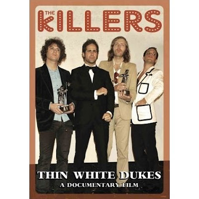
The Killers: Thin White Dukes - A Documentary Film

The music DVD cover for The Killers: Thin White Dukes - A Documentary Film;

  • The cover of this music DVD is very simple, it shows only what needs to be shown, for exmple the name of the band, the name of the music DVD and an image of the band.

I like the simplisity of this music DVD cover. However, although I want ours to be quite simple, I think that this is too simple and I would like to use a few more images of the band to show them in different locations.

The Wedding Present - Dick York's Wardrobe

The music DVD cover for The Wedding Present - Dick York's Wardrobe;

  • Visually interesting as it has lots of different images all placed together.
  • The use of different and bright colours means that the cover isn't boring to look at.
  • Has both the name of the band and the name of the music DVD on the front so that people purchasing the item know exactly who the band is.
This DVD cover isn't one of my favourites as it doesn't contain any images of the band itself. For our music DVD I will make sure that their are images of the band on the cover as the band is what will sell the music DVD, any albums and the music video.